Positioning in CSS

Most of the work we have done with CSS is fairly simple: changing fonts, colors, spacing, and borders. All of those changes are useful and necessary, but not the hard part of CSS.
Things become more interesting when you start moving stuff around the page.
The CSS position property specifies the type of positioning method used for an element (static, relative, fixed, absolute, or sticky).
The position Property
The position property specifies the type of positioning method used for an element. There are five different position values:
- static
- relative
- fixed
- absolute
- sticky
Elements are then positioned using the top, bottom, left, and right properties. However, these properties will not work unless the position property is set first. They also work differently depending on the position value.
- Position: static
The HTML elements are positioned static by default. Static positioned elements are not affected by the top, bottom, left, and right properties.
HTML
<html>
    <body>
        <div class="parent-element">
            <div class="sibling-element">
                I'm the other sibling element.
            </div>

            <div class="main-element">
                All eyes on me. I am the main element.
            </div>

            <div class="sibling-element">
                I'm the other sibling element.
            </div>
        </div>
    </body>
<html>
CSS
.main-element {
    position: static;
    left: 10px;
    bottom: 10px;
    background-color: rgb(255, 64, 0);
    padding: 10px;
}

.sibling-element {
    padding: 10px;
    background-color: #f2f2f2;
}
Result
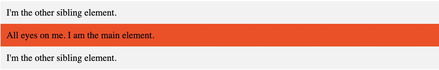
As we notice that there's no change. This confirms the fact that the left and bottom properties do not affect an element with position: static
- Position: relative
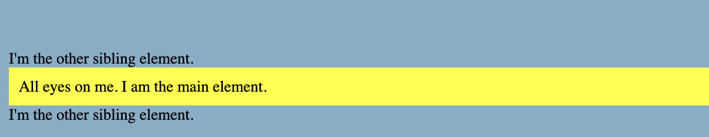
An element with position: relative; is positioned relative to its normal position. But, unlike static elements, the left, right, top, bottom, and z-index properties affect the position of the element. An offset, based on the values of left, right, top, and bottom properties, is applied to the element relative to itself.
CSS
.main-element {
    position: relative;
    left: 10px;
    bottom: 10px;
    background-color: yellow;
    padding: 10px;
}
Result
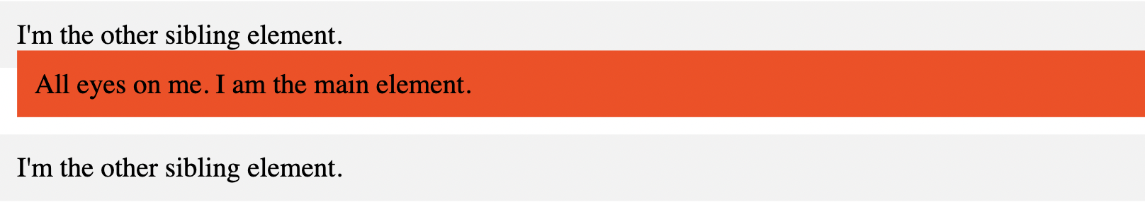
In the above example, we have replaced position: static with position: relative.
- Position: fixed
An element with position: fixed; is positioned relative to the viewport, which means it always stays in the same place even if the page is scrolled. The top, right, bottom, and left properties are used to position the element.
A fixed element does not leave a gap in the page where it would normally have been located.
One thing to note is that fixed elements are not affected by scrolling. They always stay in the same position on the screen.
CSS
.main-element {
    position: fixed;
    bottom: 10px;
    left: 10px;
    background-color: yellow;
    padding: 10px;
}

html {
    height: 800px;
}
Result
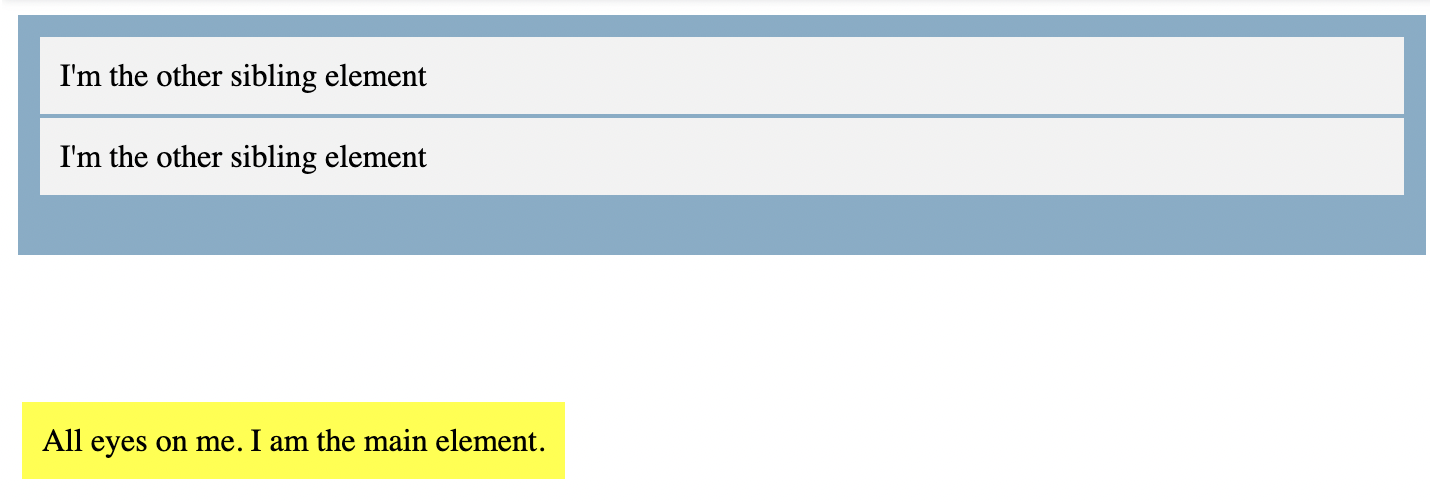
- Position: absolute
Elements with position: absolute are positioned relative to their parent elements. No space is created for the element in the page layout. The values of left, top, bottom, and right determine the final position of the element.
In this case, we change the position of the main element to position: absolute. We will also give its parent element a relative position so that it does not get positioned relative to the <html> element.
.main-element {
    position: absolute;
    left: 10px;
    bottom: 10px;
    background-color: yellow;
    padding: 10px;
}

.parent-element {
    position: relative;
    height: 100px;
    padding: 10px;
    background-color: #81adc8;
}

.sibling-element {
    background: #f2f2f2;
    padding: 10px;
    border: 1px solid #81adc8;
}
Result
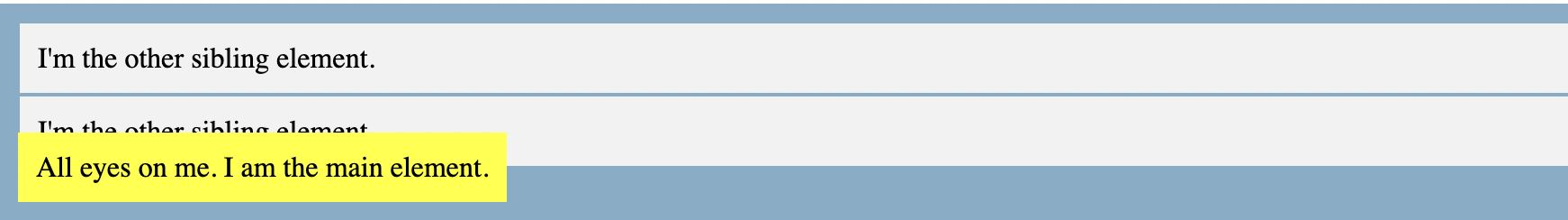
- Position: sticky
Position: sticky is a mix of position: relative and position: fixed. It acts like a relatively positioned element until a certain scroll point and then it acts like a fixed element.
.main-element {
    position: sticky;
    top: 10px;
    background-color: yellow;
    padding: 10px;
}

.parent-element {
    position: relative;
    height: 800px;
    padding: 50px 10px;
    background-color: #81adc8;
}
Result
That has been quite a ride. I really hope this article helped you understand the CSS position property and how it works.
Feel free to play around with the fiddles if you don't fully understand any of them. You can change the values and notice the difference or better still, try to use the position property to work on a personal project.


