

In this article, I have tried to teach you the CSS Flexbox basics so that you can make your own responsive sites. I'll explain how each of Flexbox's properties works, and I'll give you a cheat sheet that covers everything you can do with Flexbox. Let's Go 🎖️
The Flexbox model allows us to layout the content of our website. Not only that, it helps us create the structures needed for creating responsive websites for multiple devices.
For an instance, when you're building a house, you need a blueprint. In the same way, we need a blueprint when we're making websites. And Flexbox is the blueprint.
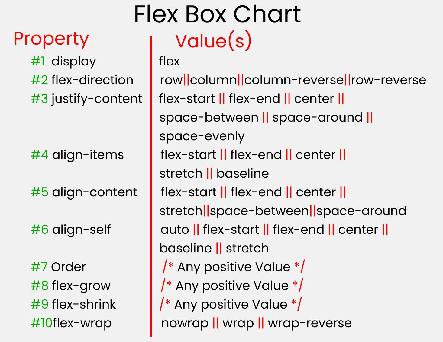
Flexbox Chart
This chart contains every possible property and value you can use when you're working with Flexbox. You can refer to it while doing your projects and experiment with different values.
Before starting, you need to understand the relationship between parent and child classes.
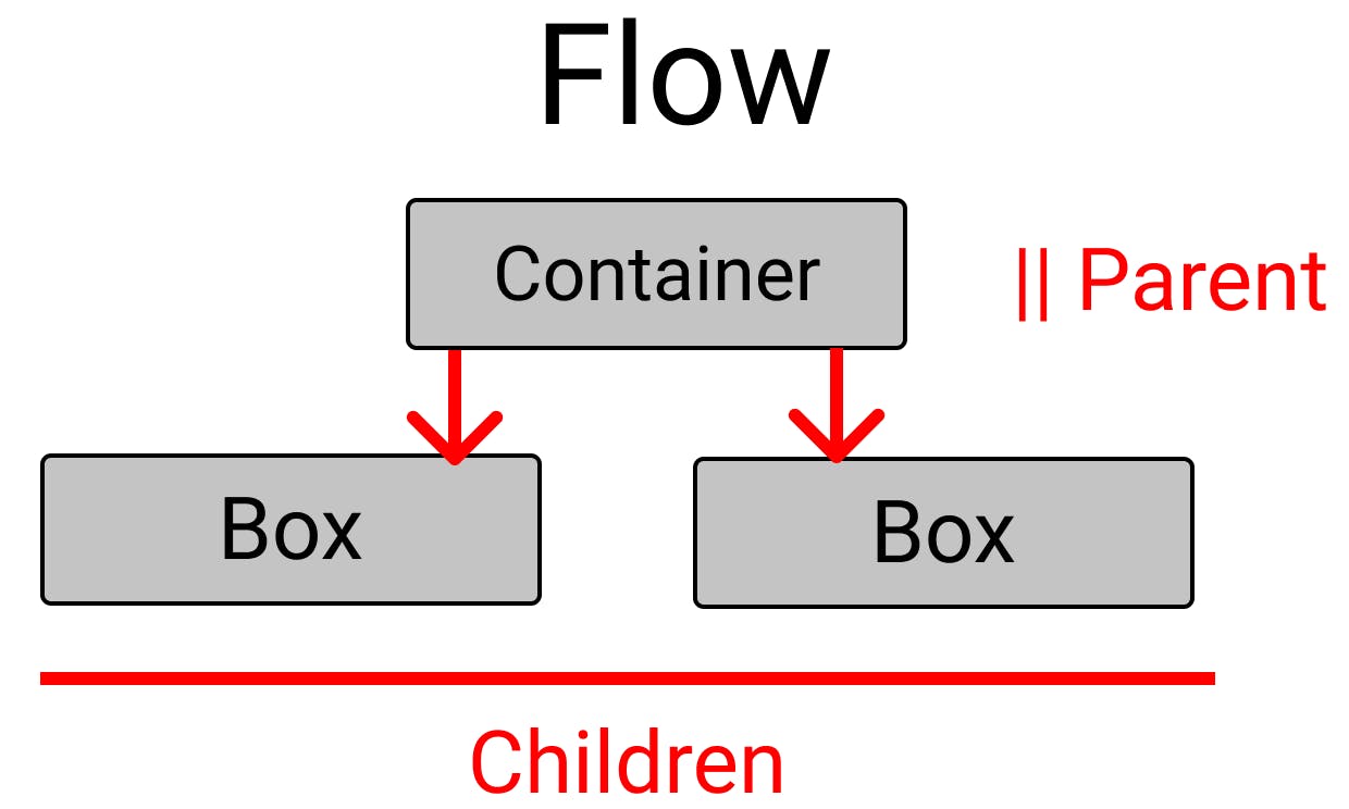
Flexbox works on the parent class, not on the child classes.
Here, the .container class is the parent and our .box-* classes are our children.
Before the flexbox layout module there were four layout modes:
Block - Used for sections on the webpage
Inline - Used for text
Table - Used for two-dimension table data
Positioned - Used for the explicit position of an element
Main Axis
The main axis direction is defined by flex-direction, the default direction is left to right.
Flexbox Elements
To start using the flexbox model, we first need to define a flex container.
<div class="container">
  <div>1</div>
  <div>2</div>
  <div>3</div>
</div>
Flexbox Properties
Display
The flex container becomes flexible by setting the display property to flex.
.container{
display: flex;
}
Output:-
Flex-direction
The flex-direction property defines in which direction the container wants to stack the flex items.
👉 Column
.container {
  display: flex;
  flex-direction: column;
}
👉 column-reverse
The column-reverse value stacks the flex items vertically (but from bottom to top).
.container {
  display: flex;
  flex-direction: column-reverse;
}
👉 row
The row value stacks the flex items horizontally (from left to right).
.container {
  display: flex;
  flex-direction: row;
}
👉 row-reverse
The row-reverse value stacks the flex items horizontally (but from right to left).
.container {
  display: flex;
  flex-direction: row-reverse;
}
Flex-wrap property
The flex-wrap property specifies whether the flex items should wrap or not.
👉 wrap
.container {
  display: flex;
  flex-wrap: wrap;
}
Output
👉 nowrap
.container {
  display: flex;
  flex-wrap: nowrap;
}
Output
👉 wrap-reverse
.container {
  display: flex;
  flex-wrap: wrap-reverse;
}
Output
Flex-flow property
.container {
  display: flex;
  flex-flow: row wrap;
}
Output
Justify-content property
👉 Center
.container {
  display: flex;
  justify-content: center;
}
Output
👉 flex-start
.container {
  display: flex;
  justify-content: flex-start;
}
👉 flex-end
.container {
  display: flex;
  justify-content: flex-end;
}
Output
👉 space-around
.container {
  display: flex;
  justify-content: space-around;
}
Output
👉 space-between
.container {
  display: flex;
  justify-content: space-between;
}
Output
Align-items property
👉 Center
.container {
  display: flex;
  align-items: center;
}
Output
👉 Flex-start
.container {
  display: flex;
  align-items: flex-start;
}
Output
👉 Flex-end
.container {
  display: flex;
  align-items: flex-end;
}
Output
Hope you have enjoyed🎉 learning about CSS Flexbox! Keep Learning, Keep Exploring!