Tailwind CSS: An Introduction

There are popular frameworks out there that many developers use to style their websites and Web projects. Alternatively, some developers learn CSS to style their Web projects without resorting to a framework. Which of these approaches works better? Like most things in development, it depends.
Using Tailwind CSS
Tailwind CSS is basically a Utility first CSS framework for building rapid custom UI. It is a highly customizable, low-level CSS framework that gives you all of the building blocks that you need. Also, it is a cool way to write inline styling and achieve an awesome interface without writing a single line of your own CSS.
Why Tailwind CSS?
As we know there are many CSS frameworks but people always choose the fast and easy framework to learn and use in the project. Tailwind has come with inbuilt a lot of features and styles for users to choose from and is also used to reduce the tendency of writing CSS code and create a beautiful custom UI. It will help you to overcome the complicated task. Tailwind CSS creates small utilities with a defined set of options enabling easy integration of existing classes directly into the HTML code.
Installation of Tailwind CSS:
Basically, Tailwind is available on npm and you can install it using the following command:
npm install tailwindcss
After that create ad Tailwind configuration file using the following command:
npm tailwind init {name of file}
OR
You can install tailwind by using the yarn command:
yarn add tailwindcss
After that create ad Tailwind configuration file using the following command:
yarn tailwind init {name of file}
Example: It is a basic example of Tailwind CSS that describes how to change the background color on mouse hover.
Advantages:
- Highly Customizable.
- Enables building complex responsive layout.
- Responsive and development are easy.
Disadvantages:
- There are missing headers and navigation components.
- It takes time to learn how to implement inbuilt classes.
Core concepts
Utility-first
Creating a framework for building custom UIs means you can't provide abstractions at the usual level of buttons, forms, cards, navbars, etc.
Instead, Tailwind provides highly composable, low-level utility classes that make it easy to build complex user interfaces without encouraging any two sites to look the same.
Below is an example of a responsive contact card component built with Tailwind without writing a single line of CSS:
Responsive Design
Using responsive utility variants to build adaptive user interfaces.
Every utility class in Tailwind can be applied conditionally at different breakpoints, which makes it a piece of cake to build complex responsive interfaces without ever leaving your HTML.
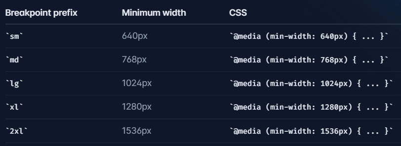
There are five breakpoints by default, inspired by common device resolutions:
Tailwind CSS Flexbox
Tailwind CSS Flex Direction
The CSS flexbox is a vital feature to develop the frontend, there are four directions available in CSS so in tailwind CSS all the properties are covered as in class form. It is the alternative to CSS flex-direction Property for fast development of the front-end.
Flex Direction:
- flex-row
- flex-row-reverse
- flex-col
- flex-col-reverse
flex-row: It arranges the row the same as the text direction. The default value of flex-direction is a row. It is used to specify that the item has a normal text direction. It makes the item follow the normal text direction in lines .flex-row: It arranges the row the same as the text direction. The default value of flex-direction is a row. It is used to specify that the item has a normal text direction. It makes the item follow the normal text direction in lines.
Syntax:
<element class="flex flex-row"> Contents... </element>
Example:
flex-row-reverse: This class is used to follow the opposite text direction. It makes flex items in reverse order exactly the opposite of the text direction as we can see in the Output.
Syntax:
<element class="flex flex-row-reverse"> Contents... </element>
Example:
flex-col: It arranges the row as a column same as the text direction but top to bottom. It is used to specify that the item has a normal top to bottom direction. It makes the item follow the normal top to bottom direction as we can see in the output.
Syntax:
<element class="flex flex-col"> Contents... </element>
Example:
flex-col-reverse: It arranges the row as a column same as row-reverse bottom to top. It is used to specify that the item has a normal bottom to top direction. It makes the item follow the normal bottom-to-top direction as we can see in the output.
Syntax:
<element class="flex flex-col-reverse"> Contents... </element>
Example:
Tailwind CSS Flex Wrap
There are three wraps available in CSS so in tailwind CSS all the properties are covered as in class form. It is the alternative to CSS flex-wrap Property.
Flex Wrap:
- flex-wrap
- flex-nowrap
- flex-wrap-reverse
flex-wrap: This class is used to break the flex item into multiple lines. It makes flex items wrap to multiple lines according to flex item width.
Syntax:
<element class="flex flex-wrap"> Contents... </element>
Example:
flex-nowrap: The default value of wrap-flex is nowrap. It is used to specify that the item has no wrap. It makes item wrap in single lines.
Syntax:
<element class="flex flex-nowrap"> Contents... </element>
Example:
flex-wrap-reverse: This class is used to reverse the flow of the flex items when they wrap to new lines.
Syntax:
<element class="flex flex-wrap-reverse"> Contents... </element>
Example:
Tailwind CSS Grind
Tailwind CSS Grid Template Columns
It is used to set the number of columns and size of the columns of the grid, here we will do the same but for fast development of front-end. The number of columns is set by the number of values given to this class.
Syntax:
<element class="grid grid-cols-number"> Contents... </element>
Example:
Tailwind CSS Grid Column Start / End
This class accepts more than one value in tailwind CSS all the properties are covered as in class form. It can change the layout of grid items irrespective of their source order, which allows moving grid items around to cater to these varying contexts without having to modify the underlying markup.
Spanning columns (col-span): This class will cover the span area, mentioned number after the class will holds the area of a span, we all know that there are 12 grid column or you can say 12 grid span.
Syntax:
<element class="col-span-number"> Contents... </element>
Class Grid Value: This class accepts a single value as mentioned above and described below:
-number: It holds the number of spans a grid column will take.
Example:
Starting and ending lines (col-start|end): This class is used to make an element start or end at the nth grid line. These can also be combined with the col-span-number utilities to span a specific number of columns.
Syntax:
<element class="col-start|end-number">..</element>
Example:
👉 Responsive Design
sm
minimum width 640px CSS @media (min-width: 640px) { ... }
md
minimum width 768px CSS @media (min-width: 768px) { ... }
lg
minimum width 1024px CSS @media (min-width: 1024px) { ... }
xl
minimum width 1280px CSS @media (min-width: 1280px) { ... }
2xl
minimum width 1536px CSS @media (min-width: 1536px) { ... }
👉 Mobile First
By default, Tailwind uses a mobile-first breakpoint system, similar to what you might be used to in other frameworks like Bootstrap.
<!-- This will center the text on mobile, and left align it on screens 640px and wider -->
<div class="text-center sm:text-left"></div>
👉 Targeting a single breakpoint
<div class="bg-green-500 md:bg-red-500 lg:bg-green-500">
  <!-- ... -->
</div>
👉 Customizing breakpoints
You can completely customize your breakpoints in your tailwind.config.js file:
 module.exports = {
   theme: {
     screens: {
       'tablet': '640px',
       // => @media (min-width: 640px) { ... }
       'laptop': '1024px',
       // => @media (min-width: 1024px) { ... }
       'desktop': '1280px',
       // => @media (min-width: 1280px) { ... }
     },
    }
  }
I've only scratched the surface on Tailwind CSS, but I hope you can see the benefit of using Tailwind CSS. Tailwind CSS avoids the problem of making every website look exactly the same, but, at the same time, can improve the speed in developing custom CSS solutions.
Thank you for reading.
More Articles:


